Visualizing Machine Learning
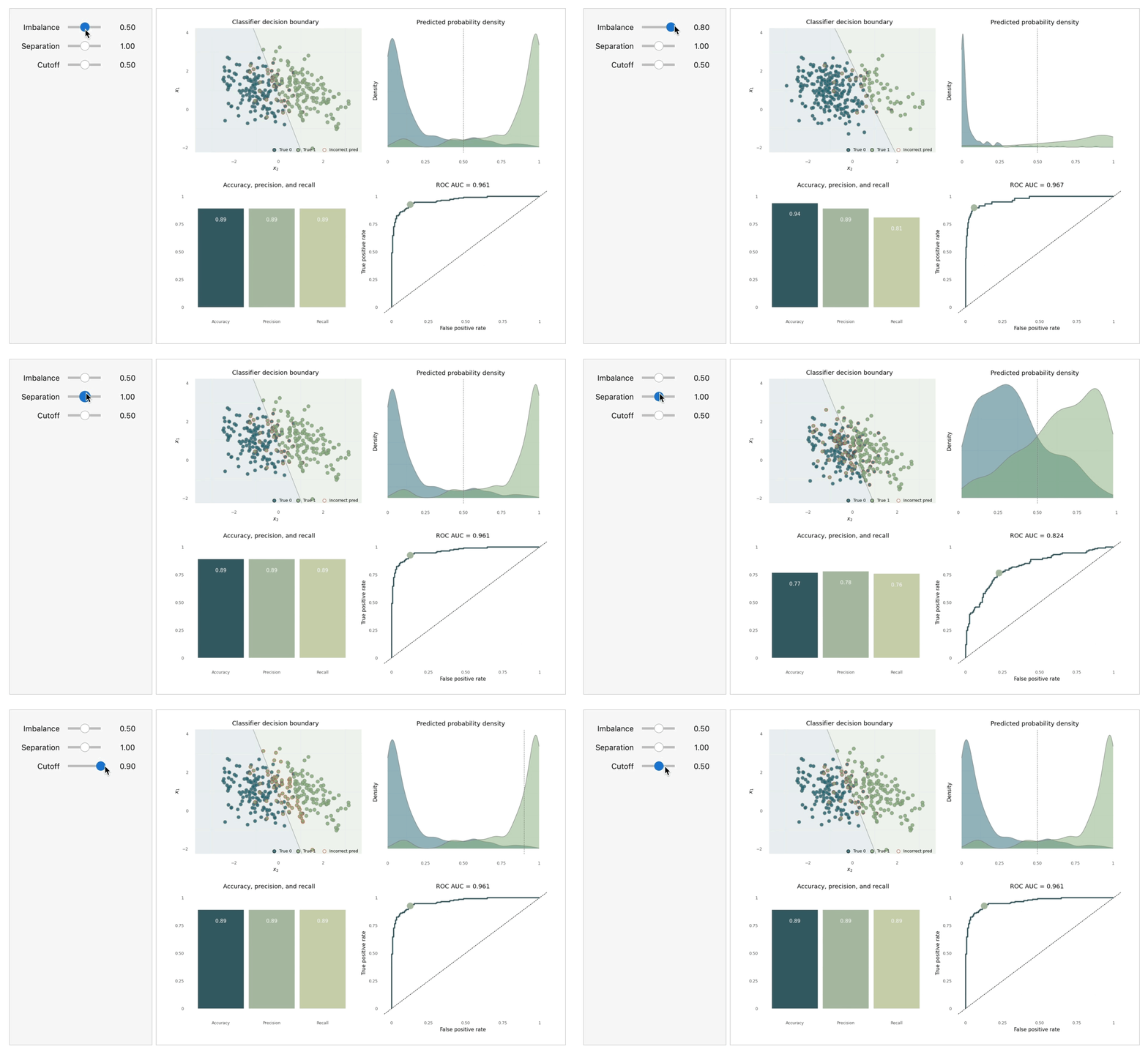
I created an interactive dashboard to visualize the effects of imbalanced data and other parameters on model performance metrics. This is part of a larger effort to use visualization to help convey the intuition behind machine learning models and concepts.
For ease of accessibility, the dashboard was created in a Jupyter notebook and can be used within the notebook itself or deployed using Python’s Voila framework. To learn more about the project, see the GitHub link above.
